Ah, Starbucks. My morning ritual, my little pick-me-up, and the bearer of my much-needed caffeine dose as I hustle through the early hours. Clutching that familiar cup adorned with the iconic logo, I’ve lost count of the countless times it’s been my companion. But, here’s the kicker – did you know there’s a little secret hidden in that logo we’ve all come to recognize and love? Yeah, I was just as surprised!

Let’s take a tiny step back and spill some beans on the Starbucks saga before diving into the juicy part. Nestled in every cup is a siren, a figure straight out of sea tales and myths, reminiscent of the enchanting characters from the likes of Herman Melville’s epic, Moby Dick. And guess what? The Starbucks moniker itself is a nod to this literary classic.
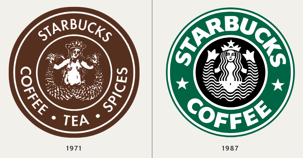
Starbucks was born in 1971, and with it, the first version of its logo—an intricate design featuring a twin-tailed mermaid, or siren, inspired by a 16th-century Norse woodcut. This brown emblem was a stark departure from the sleek green design we know today. As the company evolved, so did its logo, reflecting the brand’s growth and the changing times.
From its humble beginnings, the Starbucks emblem has undergone quite the transformation. Picture this: it started with a brown hue back in the day, only to dive into the iconic green sea in 1987. This color change wasn’t just about aesthetics; it represented Starbucks’ shift toward a more modern, global identity. Green, often associated with growth, freshness, and nature, was the perfect color to symbolize Starbucks’ mission of offering a unique coffee experience.
Fast forward to 1992, as Starbucks stepped onto the public stage, the logo got a chic, modern facelift. The siren became more refined, with a focus on her upper body rather than the full figure, reflecting a streamlined, consumer-friendly brand.
But hold your horses; the real game-changer came in 2011. This was when “Starbucks Coffee” bid adieu to the logo, shining the spotlight solely on our siren’s face, now more symmetrical, more…mysterious. The decision to remove the text was bold, signaling Starbucks’ confidence in its brand recognition. The siren had become an icon in her own right, and no words were needed to identify the brand.
This minimalist approach aligned with modern design trends, focusing on simplicity and universal appeal. Yet, even as the logo became more straightforward, it retained a certain enigmatic quality, drawing consumers in with its timeless allure.

But here’s where it gets interesting. Take a closer look next time you’re sipping your latte. There’s a subtle quirk in the siren’s features that might just escape your first glance. It’s all in the asymmetry, my friends. While her face presents a picture of symmetry, a closer inspection reveals a slight tilt in the tale – the right side of her face is subtly more shadowed than the left.
Notice how her nose takes a tiny dip more on the right? Or how her right eye seems to play hide and seek, cloaked in the shadow cast by the bridge of her nose? That’s because the Starbucks design team made a conscious choice to incorporate this subtle imperfection. Why, you ask? The answer lies in a desire to humanize the siren. They wanted her to be more relatable, more connected to the human experience, which is inherently imperfect.
This tiny detail, almost imperceptible unless you’re really looking, adds a layer of depth to the logo. It’s not just about creating a memorable brand image; it’s about evoking a sense of familiarity and warmth. The imperfection makes the siren less of an untouchable icon and more of a friendly figure, someone you wouldn’t mind sharing your morning coffee with.

It’s these little details, so easily overlooked amidst our daily grind, that add layers to the Starbucks experience. The siren’s asymmetry is a testament to the power of thoughtful design. It’s a reminder that even in a world where perfection is often sought, it’s the imperfections that make something truly memorable and endearing.
This design philosophy aligns with the broader Starbucks brand, which emphasizes warmth, community, and connection. By introducing this subtle flaw, Starbucks creates a logo that feels approachable and human, reflecting the brand’s values.
So, next time you’re cradling that warm cup of coffee, ready to tackle the day, give the siren a second glance. There’s more to her than meets the eye, a secret whispered through the ages, nestled in the heart of Starbucks’ emblematic embrace. Who knew a morning coffee run could hold such an enchanting tale?
The Starbucks logo is more than just a brand identifier; it’s a symbol rich with history, cultural significance, and a touch of mystery. The subtle asymmetry in the siren’s face is a clever design choice that adds depth and character to the logo, making it not just recognizable but also relatable. So, the next time you pick up your Starbucks coffee, take a moment to appreciate the thought and artistry behind that iconic green siren—it’s a story worth savoring with every sip.


