When it comes to fast food, Wendy’s holds a special place in the hearts of many. From their fresh, square burgers to the irresistible Frosty, there’s a nostalgic charm about this brand. But beyond the tasty menu lies a fascinating secret in their iconic logo—one that most people don’t even notice at first glance. Once you see it, you’ll never look at the Wendy’s logo the same way again.
The Iconic Wendy’s Logo

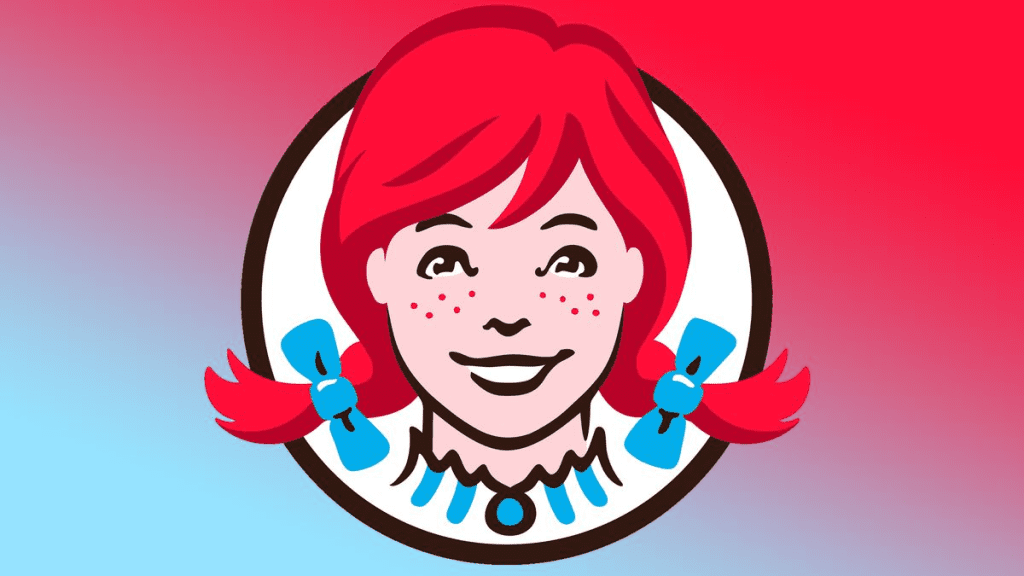
The Wendy’s logo is one of the most recognizable in the fast-food world. Featuring a cheerful red-haired girl with freckles, tied pigtails, and a ruffled blue-collared shirt, the logo embodies a friendly and wholesome vibe. Wendy’s was named after the founder Dave Thomas’s daughter, Melinda Lou “Wendy” Thomas, and the logo reflects that personal touch.
At first glance, it seems straightforward—a charming illustration of Wendy that perfectly captures the brand’s friendly and approachable personality. But hidden within this seemingly simple design is a thoughtful and heartwarming detail that reinforces the brand’s core values.
The Hidden “MOM” in the Logo
Take a closer look at Wendy’s collar in the logo. Notice the ruffled folds? If you focus on the design, you’ll see the word “MOM” subtly spelled out within the folds of her collar. This detail isn’t just an artistic coincidence—it’s a deliberate choice by the designers to convey a deeper message.
The inclusion of “MOM” ties Wendy’s food to the comfort and warmth of a home-cooked meal. It’s a clever nod to the love and care that a mother puts into her cooking, subtly suggesting that Wendy’s food is made with the same dedication and quality. It’s more than fast food; it’s food that feels personal and familiar, like something you’d get at home.
Why “MOM” Matters in Wendy’s Branding
The fast-food industry is often associated with speed and convenience, but Wendy’s has always positioned itself differently. From their “fresh, never frozen” beef to their commitment to quality, Wendy’s emphasizes a more thoughtful approach to food. Embedding “MOM” into their logo reinforces these values.
- Nostalgia and Comfort: By evoking the warmth of a home-cooked meal, Wendy’s connects with customers on an emotional level. It’s not just about satisfying hunger—it’s about creating a sense of comfort and familiarity.
- Family-Oriented Values: Wendy’s roots are steeped in family, and the logo reflects that. Founder Dave Thomas built the brand with the values of trust, care, and quality in mind, and “MOM” serves as a subtle reminder of those principles.
- Standout Design: The hidden “MOM” also sets Wendy’s apart in the crowded fast-food market. It adds depth to the logo, making it more memorable and giving customers something to discover and appreciate.
Other Logos with Hidden Messages
Wendy’s isn’t the only brand with a clever design element in its logo. Many companies incorporate subtle details that tell a story or reflect their values. Let’s take a look at some other famous examples:
1. Subway’s Directional Arrows
The Subway logo features arrows at both the beginning and end of the word. These arrows represent the entrance and exit of a subway station, perfectly tying the logo to the brand’s theme of quick, on-the-go meals. It’s a simple yet effective way of emphasizing convenience and speed.

2. Toblerone’s Hidden Bear
The Toblerone logo, depicting a mountain, has a hidden bear within the silhouette. This is a nod to the chocolate’s origin in Bern, Switzerland, a city famously associated with bears. It’s a clever way to honor the brand’s heritage while adding an element of discovery for consumers.
3. Amazon’s Smile
Amazon’s logo features an arrow that stretches from the “A” to the “Z,” forming a smile. This represents the company’s commitment to delivering everything “from A to Z” while keeping customers happy. It’s a brilliant combination of practicality and positivity.
The Power of Thoughtful Logo Design
Logos are more than just symbols—they’re a brand’s identity distilled into a single image. Hidden details like Wendy’s “MOM” or Toblerone’s bear turn logos into stories, giving consumers a deeper connection to the brand.
- They Create a Sense of Discovery: Finding a hidden message in a logo is like uncovering a secret. It adds an element of fun and intrigue that makes the brand more memorable.
- They Reinforce Brand Values: Subtle design elements can communicate a brand’s mission or values without words, making the message more impactful.
- They Build Emotional Connections: A thoughtful logo design can evoke feelings of trust, nostalgia, or excitement, creating a stronger bond between the brand and its customers.

Wendy’s Logo: A Masterclass in Branding
The “MOM” in Wendy’s logo might be easy to miss, but its impact is profound. It encapsulates everything the brand stands for—quality, care, and a connection to family. It’s a reminder that even in the fast-paced world of fast food, Wendy’s aims to deliver something more meaningful than just a meal.
The logo’s hidden detail also highlights the importance of thoughtful design in branding. In an industry where standing out is crucial, small touches like this make a big difference. Wendy’s doesn’t just sell food—it sells an experience, a feeling of warmth and nostalgia that keeps customers coming back.
Conclusion: A Small Detail with a Big Impact
The hidden “MOM” in Wendy’s logo is more than just a clever design—it’s a testament to the brand’s dedication to quality, comfort, and family values. It’s a subtle yet powerful way of communicating their mission and connecting with customers on an emotional level.
So, the next time you see Wendy’s logo, take a moment to appreciate the thought and care that went into its design. It’s a reminder that even the smallest details can carry big messages. And who knows? This newfound appreciation might just make that Frosty taste a little sweeter.


